Dexter Brand Guide
Dexter ships five themes across iOS, Android, and the web. Every color,
size, and space in the app comes from one token file —
src/utils/theme.ts — and this page is that file, rendered.
Colors
Each theme is a full palette. Surfaces come in two steps, and the direction is the point: background is the content sheet and the lightest surface in the theme, and sunken is everything that frames content — cards, inputs, rows, the nav rail. A divider goes further down the same ramp: the border is opaque and tuned per theme rather than derived from an alpha of the text color, because one alpha that reads on a light surface disappears on a dark one.
Dexter
light ·dexter
#fffbf4
#f7f1e7
#e0d5c2
#00674f
#c3ffcf
#593d31
rgba(89, 61, 49, 0.6)
#00d390
#004c39
#ff627d
#4d0218
Task priority
#fcb700
#fdc531
#ff627d
#ff8195
#00bafe
#33c7fc
#fffbf4
#fffbf4
#593d31
#7a6358
Left half is the accent — dots, bars, badges. Right half is the muted fill a task card is painted with: the same accent pre-blended over this theme's background at 80%. Pre-blending keeps the card opaque, so it can't shift color when it sits over a pane that isn't the standard background.
Light
light ·light
#ffffff
#f8f8f8
#e0e0e0
#422ad5
#e0e7ff
#18181b
rgba(24, 24, 27, 0.6)
#00d390
#004c39
#ff627d
#4d0218
Task priority
#fcb700
#fdc533
#ff627d
#ff8197
#00bafe
#33c8fe
#ffffff
#ffffff
#09090b
#3a3a3c
Left half is the accent — dots, bars, badges. Right half is the muted fill a task card is painted with: the same accent pre-blended over this theme's background at 80%. Pre-blending keeps the card opaque, so it can't shift color when it sits over a pane that isn't the standard background.
Dim
dark ·dim
#2a303c
#242933
#1c212b
#9fe88d
#091307
#b2ccd6
rgba(178, 204, 214, 0.6)
#62efbd
#03140d
#ffae9b
#160b09
Task priority
#efd057
#c8b052
#ffae9b
#d49588
#28ebff
#28c6d8
#2a303c
#2a303c
#1c212b
#1f242e
Left half is the accent — dots, bars, badges. Right half is the muted fill a task card is painted with: the same accent pre-blended over this theme's background at 80%. Pre-blending keeps the card opaque, so it can't shift color when it sits over a pane that isn't the standard background.
Dark
dark ·dark
#1d232a
#191e24
#15191e
#605dff
#edf1fe
#ecf9ff
rgba(236, 249, 255, 0.6)
#00d390
#004c39
#ff627d
#4d0218
Task priority
#fcb700
#cf9908
#ff627d
#d2556c
#00bafe
#069cd4
#1d232a
#1d232a
#09090b
#0d0e11
Left half is the accent — dots, bars, badges. Right half is the muted fill a task card is painted with: the same accent pre-blended over this theme's background at 80%. Pre-blending keeps the card opaque, so it can't shift color when it sits over a pane that isn't the standard background.
Abyss
dark ·abyss
#001e29
#00111d
#000c15
#bdff00
#427600
#ffd6a7
rgba(255, 214, 167, 0.6)
#01df72
#022d14
#f04e4f
#690000
Task priority
#ffbf00
#cc9f08
#f04e4f
#c04447
#00bafe
#009bd3
#001e29
#001e29
#003843
#00333e
Left half is the accent — dots, bars, badges. Right half is the muted fill a task card is painted with: the same accent pre-blended over this theme's background at 80%. Pre-blending keeps the card opaque, so it can't shift color when it sits over a pane that isn't the standard background.
In context
The same task card in every theme — a priority-muted fill, the theme's hairline border, and content drawn in the matching priority-content color.
Typography
Dexter uses the platform's own UI font — San Francisco on Apple platforms,
Roboto on Android, the system stack on the web. There are six type roles,
and each pairs a size with the weight it is always drawn at, so applying a
role sets both. Pick the role by what the text is for, not by
measuring it: a 15pt semibold label is a title even though 15 is
closer to body's size.
| Role | Weight | Comfortable | Compact | Used for |
|---|---|---|---|---|
subtitle |
400 | 12px | 11px | The second line under a title |
body |
400 | 14px | 12px | Running prose, row labels, event names, what a field holds |
control |
600 | 16px | 14px | Buttons and the web date/time pickers |
title |
600 | 16px | 14px | A component's primary line |
heading |
700 | 24px | 20px | The screen or pane you are on |
display |
900 | 40px | 32px | The login splash |
subtitle — Get and stay organized
body — Get and stay organized
control — Get and stay organized
title — Get and stay organized
heading — Get and stay organized
display — Get and stay organized
Density
Every numeric token comes in two tiers. compact is a pointer
tier, not a size one: the web app picks it at and above 768px, where a cursor
hits a small target as easily as a large one. Everything touched with a
finger — every phone and tablet — stays comfortable, however
wide the screen. The tiers are written out in full rather than scaled from
one another — spacing wants to tighten harder than type does, and a
scaled-down subtitle stops being legible well before the padding stops being
roomy.
| Tier | Applies | space | controls | icons | radius |
|---|---|---|---|---|---|
comfortable |
Every native device, and web below 768px | 4 / 8 / 16 / 24 | 40 / 32 | 14 / 20 | 12 |
compact |
Web at 768px and up — desktop browsers | 3 / 6 / 12 / 18 | 32 / 26 | 12 / 18 | 12 |
Spacing
Four steps, used for padding, margins, and flex gaps alike. Bars below are drawn at the comfortable tier.
xs
4 / 3px
A label and the thing it labels
sm
8 / 6px
Controls in a row, cards in a list
md
16 / 12px
The standard screen inset and pane gutter
lg
24 / 18px
Between groups — settings sections, sheet edges
Border radius
Dexter has one corner radius —
12px — shared by cards, inputs,
panes, tiles, and buttons, and deliberately the same on both density tiers: a
card should read as the same card on a phone and a desktop, just a smaller
one. Shapes meant to be round use a full radius instead. There is no
small/large radius; if something looks like it needs one, it is usually the
wrong size rather than the wrong radius.
radii.md
radii.full
Iconography
Dexter draws SF Symbols on iOS and
Ionicons on Android and the web. Every icon in the app names
both, and both travel together through one Icon component, so
neither platform can silently fall back to a third icon set.
Two places are exceptions and say so in the code: the native tab bar, whose API accepts only an SF Symbol plus an Android drawable; and the note editor's bold/italic/underline/strikethrough toggles, for which Ionicons has no glyph.
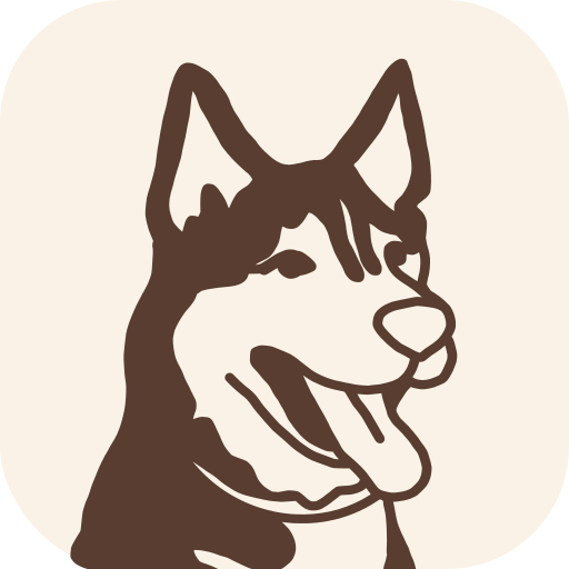
The app mark is a husky in line art on
cream. The vector at src/assets/app.icon/Assets/Vector.svg is the
source every platform icon is generated from.
Using these tokens
src/utils/theme.ts is canonical. Nothing in the app writes a
style value as a literal — every color, size, radius, space, and icon size is
read from useTheme(). The full rules, including the short list of
documented exceptions, live in
docs/design.md.